Volvo Infotainment Redesign

Design Exercise

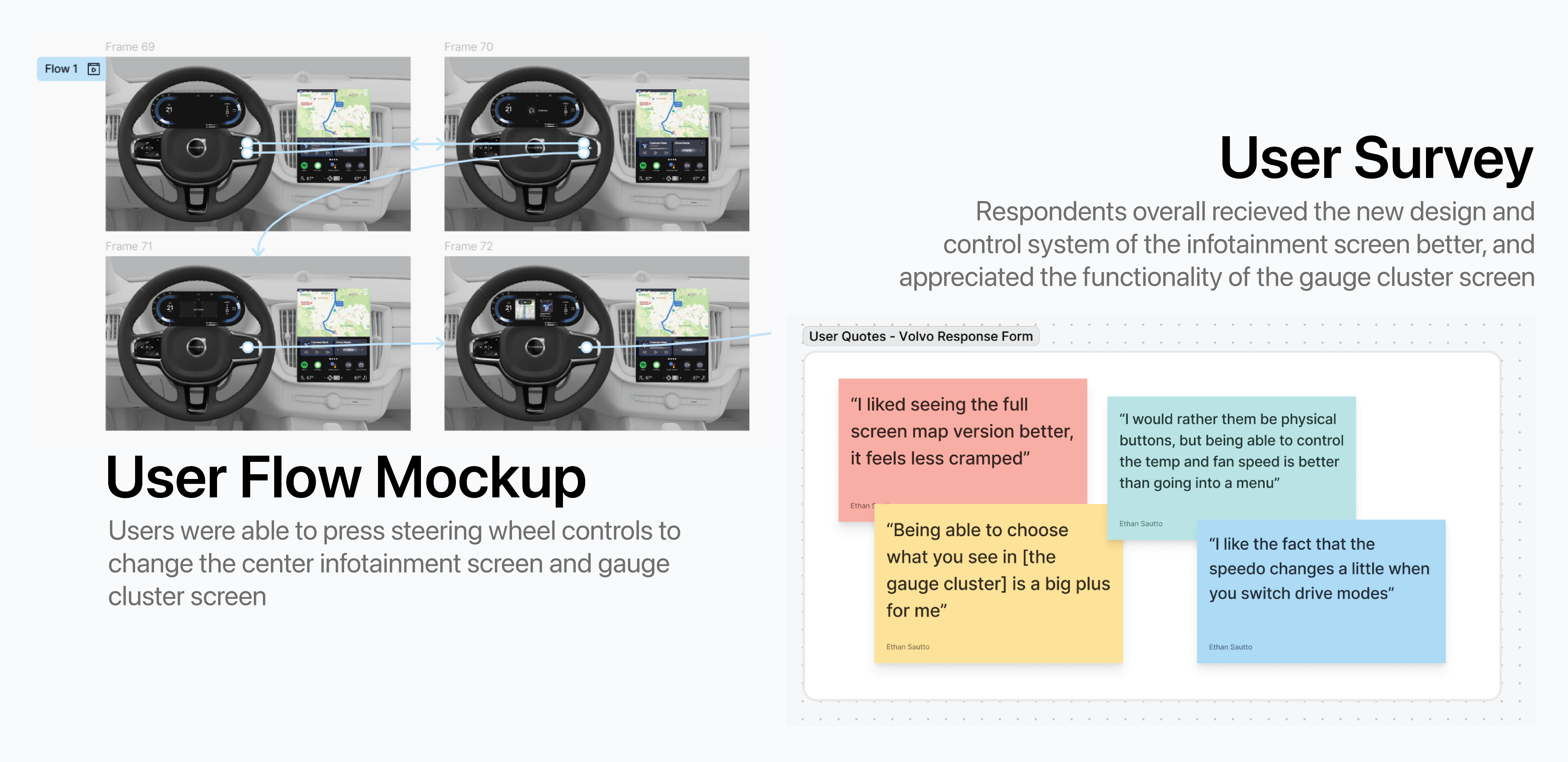
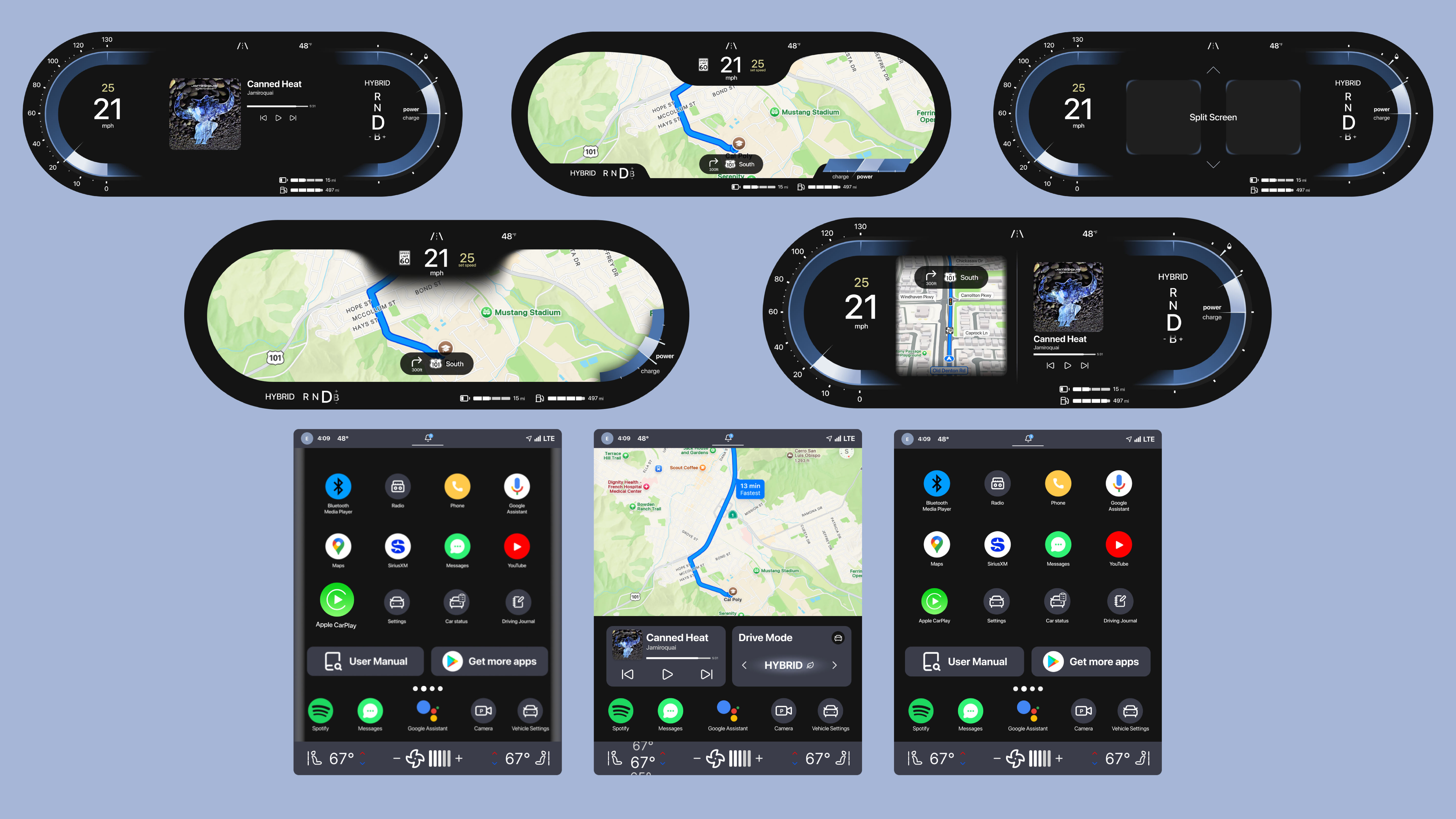
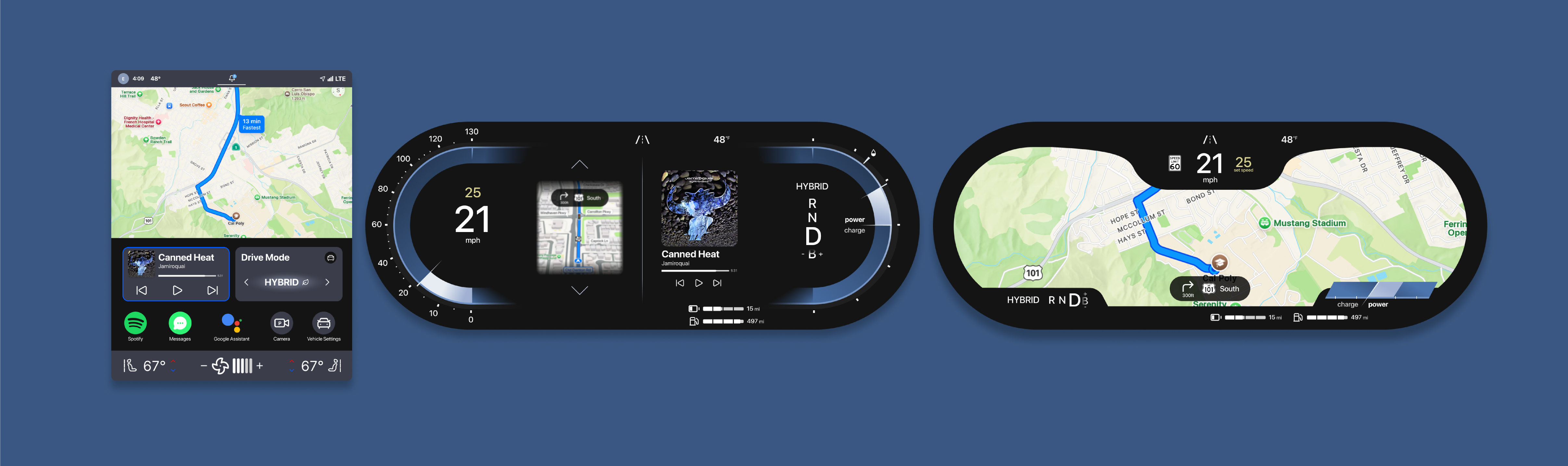
Redesigned Volvo's current gauge cluster and infotainment screens to offer more functionality and accessibility.

A collection of screens from the final product.

Role

UX Designer

Tools

Figma logo.
Figjam logo.

Timeline

4 weeks

Description

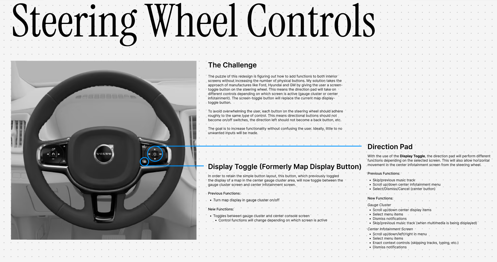
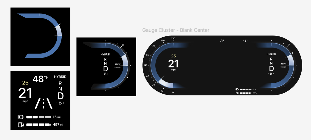
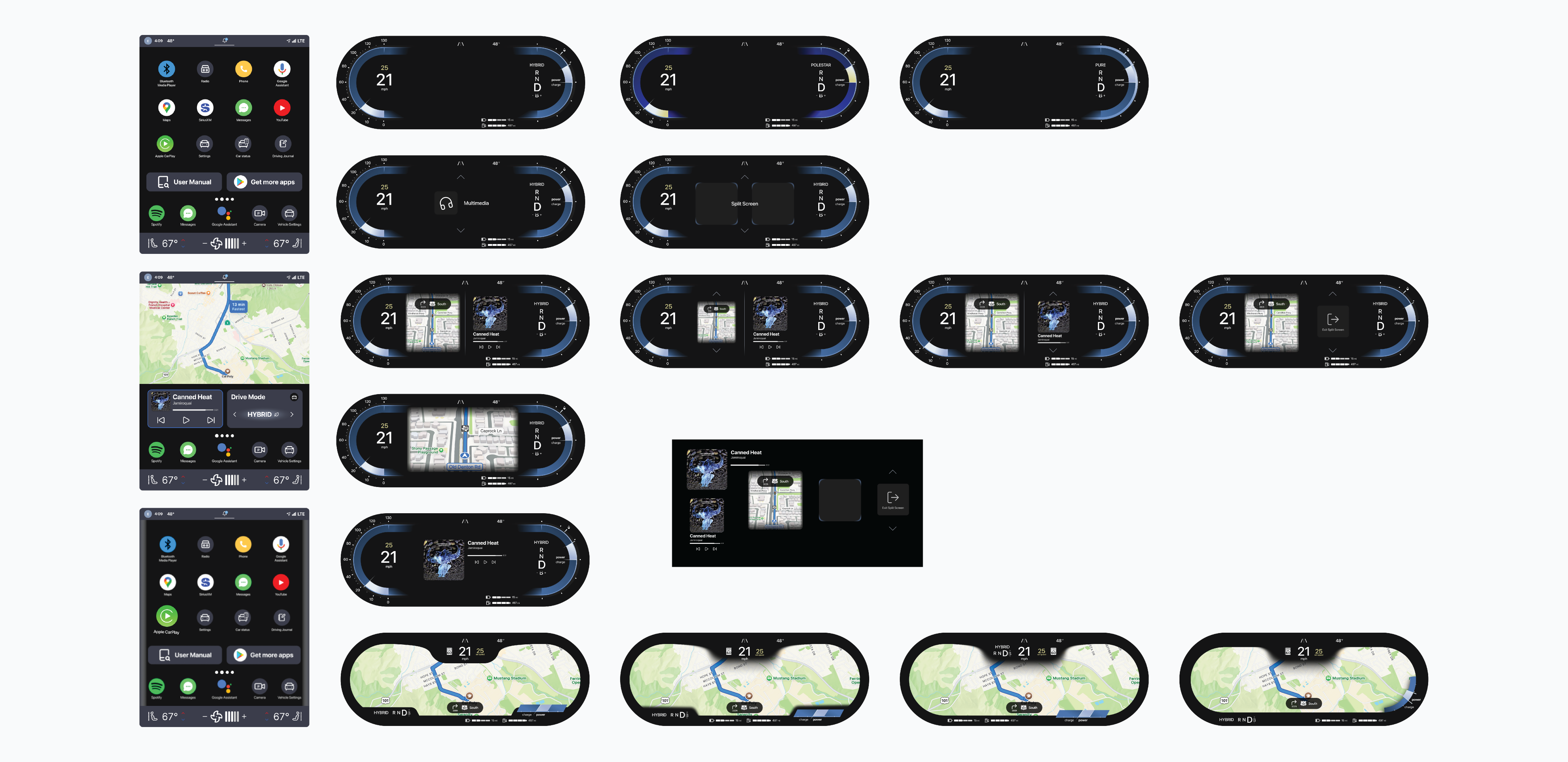
Improved center infotainment screen and redesigned gauge cluster with greater functionality including full screen and split screen displays.

Context

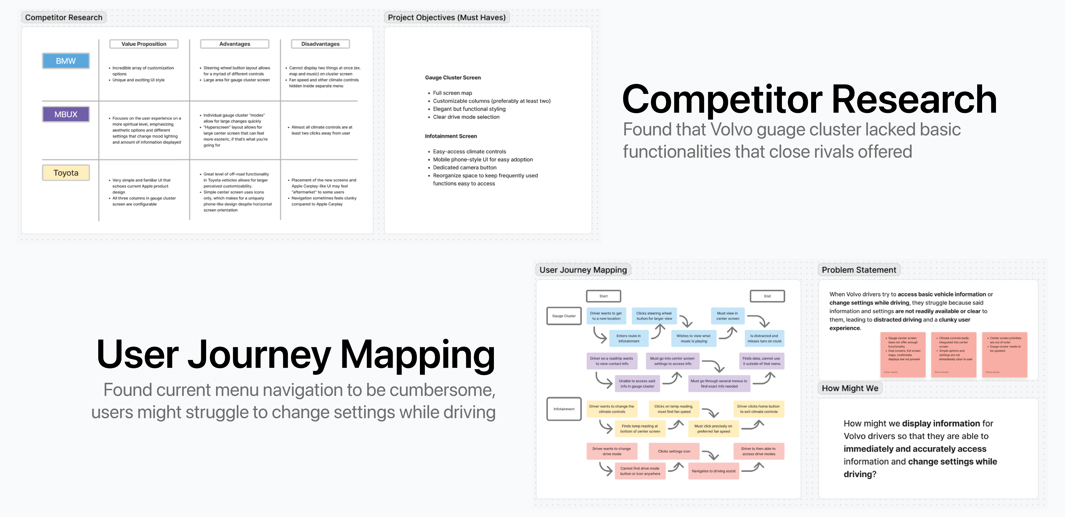
I watch a lot of car reviews to keep up on the latest design trends in infotainment. When watching a review on the 2025 XC60, I was surprised at the limited functionality of their interior screens. I wanted to see what I could do to improve functionality in both the gauge cluster and center infotainment screens without adding complexity to physical controls.

Research

The goal for any infotainment system should be to convey information to the user in a way that does not interfere with their driving. In order to create a hierarchy of information by which I would design accordingly, I started with mapping the user journey.

Additionally, I did competitive research to determine what other brands prioritized in their screens. My initial research gave me some great initial goals.

Journey map and competitor research exercise. A photo of a Volvo steering wheel with annotations describing the new control scheme.

Pain Points

  • Gauge cluster screen can only display map/no map
  • Critical driver and climate controls hidden in menus
  • Simple options and settings are not immediately clear
  • Lack of customization/dual screen functionality

Solution

Redesign cluster and infotainment layouts to display information for Volvo drivers so that they are able to immediately and accurately access information and change settings while driving.

Design Process

After preliminary sketches, I started by recreating the current gauge cluster.

Since I planned to give users the ability to display two things at once, I needed to make sure space wasn't going to be an issue. I created multiple versions of each screen element to see what it would look like inside the gauge cluster. I also created the more liminal elements that would be viewed by a driver when modifying their display.

Elements and iterations of the gauge cluster screen.

It was very important to me that I represented not only the different display types, but the menus a driver would need to navigate to get there. A driver should be able to scroll through a menu almost subconciously; the driver should not have to split their attention between the road and the interior screens.

Users would also be able to pick up apps and drag them to their homescreen widget or just reorganize them in a style similar to a smart phone. In my opinion, car interiors with large center screens (especially those oriented vertically) should follow the UX of mobile devices since it's already what a user will expect from a touchscreen.

Iterations of the new infotainment and gauge cluster screens.

Getting Creative with User Testing

After iterating on my designs for a week, I was happy with my solution. But what does that matter? I needed to put my design to the test with user research.

In order to properly simulate the operation of a gauge cluster screen, I made a digital version of the steering wheel controls. I had my participants use these controls to navigate the gauge cluster, which I positioned relative to the wheel. I also recreated Volvo's current infotainment system to compare to my own.

The prototype flow of the gauge cluster and sticky notes with quotes from survey and interview respondents.

With everything in place, I was able to test whether my changes had benefited or detracted from the overal user experience. I used A/B testing to determine which gauge cluster was the most favorable regarding useablility and aesthetics, tested 10 different subjects on their ability to execute basic tasks, then conducted a survey on user's likes and dislikes of the new system. In the end, these were the results:

  • 8/10 of users were able to identify and toggle between two gauge cluster displays with no mistakes
  • Users overwhelmingly favored the ability to display two things at once in the gauge cluster
  • Users performed basic climate control tasks on my screen 4 seconds faster than with Volvo's infotainment screen on average
  • While initially unsure about the steering wheel controls, 9/10 users favored them compared to Volvo's

Final Product + Takeaways

A gallery of end product screens.

I was very pleased with the outcome of this project. It's a smaller case study, but it has to do with an area of UX that I'm particularly passionate about.

It was fun to try and navigate user testing for multiple screens that had to be navigated by a separate set of controls. Having to design screens that can be controlled in multiple ways adds a layer of complexity that I appreciate. I also just loved designing the small details of each screen.

Even though Volvo has updated their infotainment screen since the start of this project, I still think I made some very important tweaks, and I certainly improved the functionality of the gauge cluster. As more cars move towards fully digital dashes, I'm excited to see what innovations will look like.

Just from this project alone, I can say I really do enjoy watching people's initial reactions to controls/screen layouts. It's extremely satisfying to see your decisions change how users interact with their car.

Thanks for viewing.

Next Project | Aston Martin Web Redesign