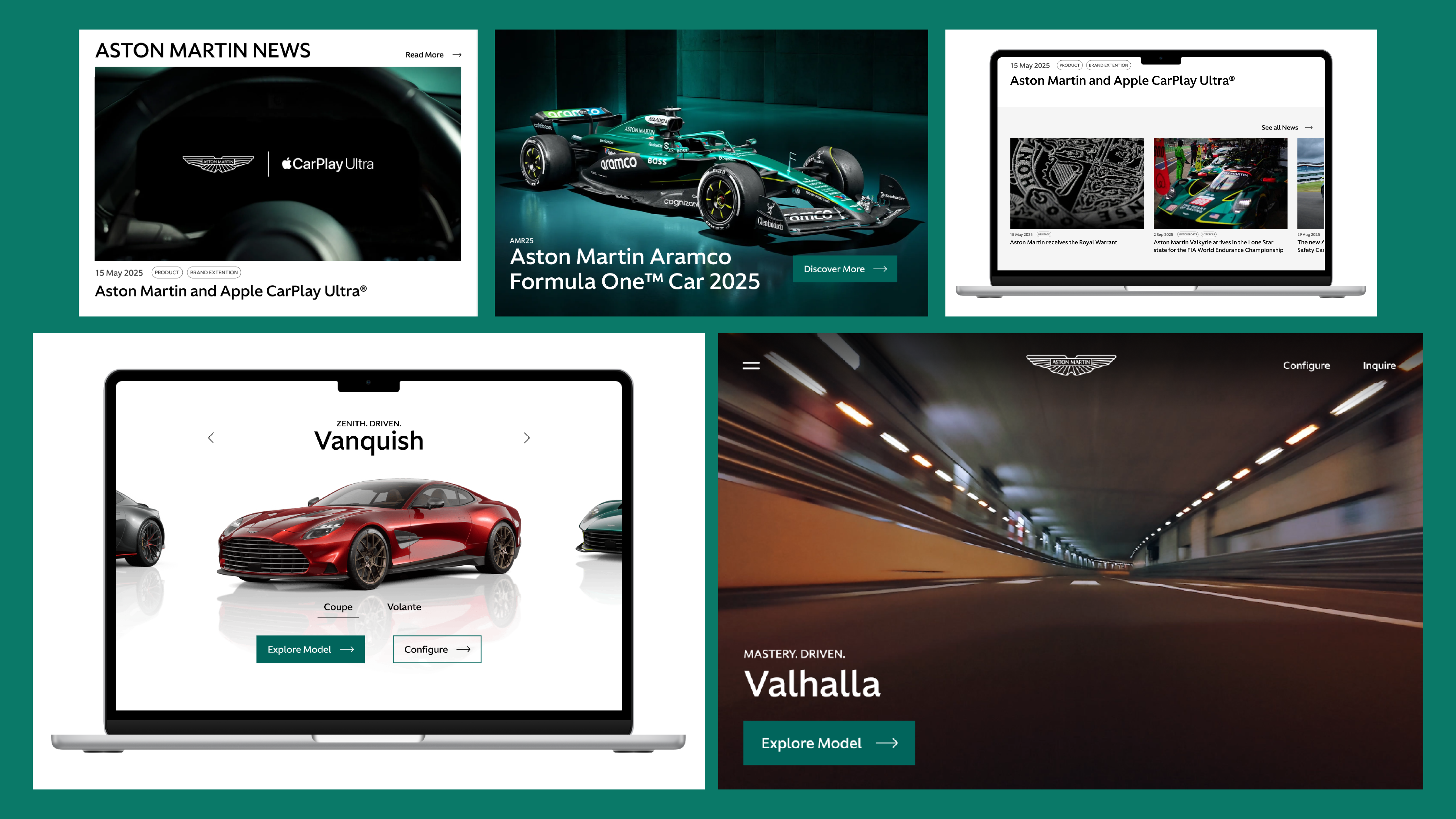
Case Study — Aston Martin
Case Study — Aston Martin
Design Exercise
Duration
Skills Used
Tools
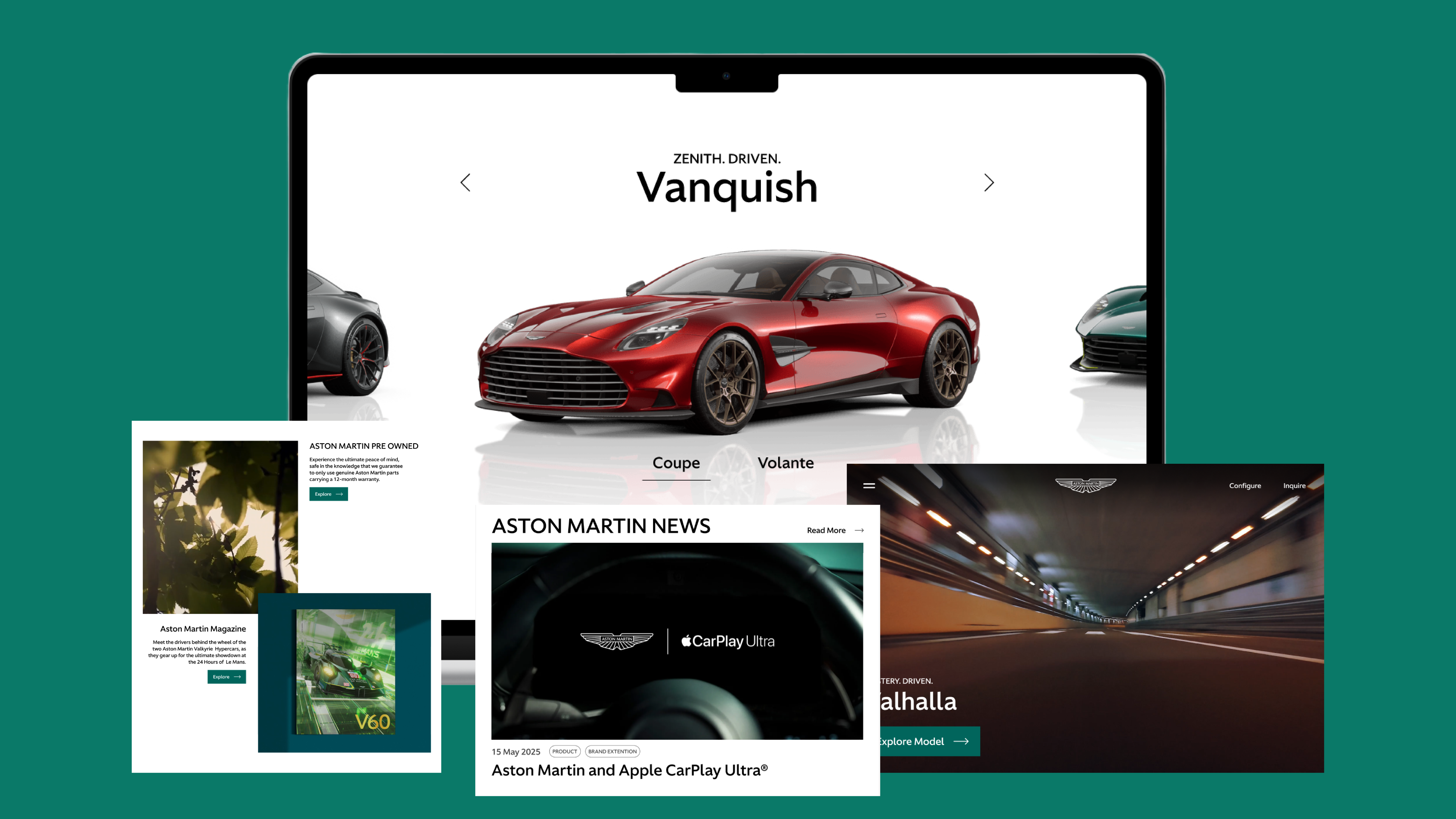
Project Brief
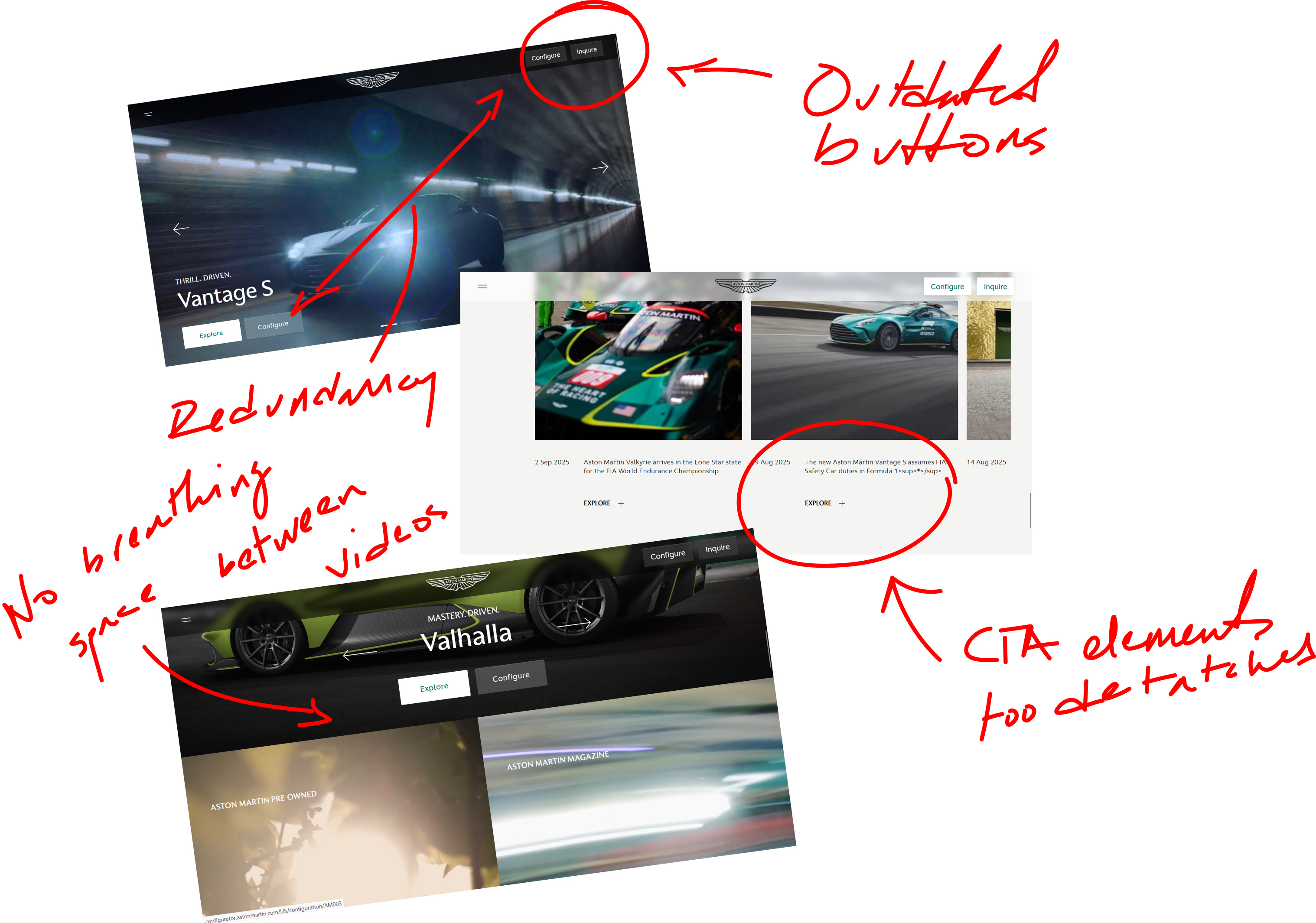
Pain Points
Solution
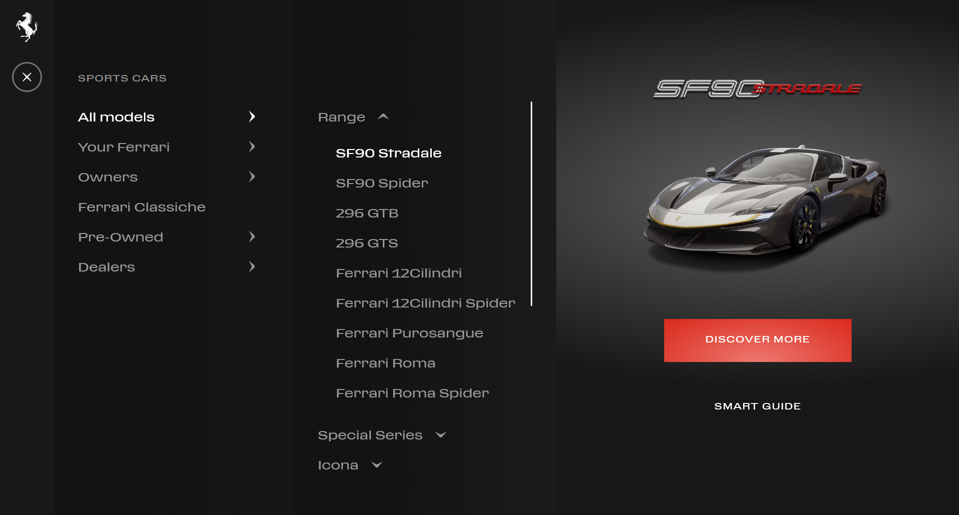
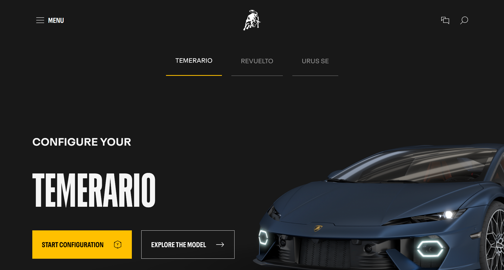
Research
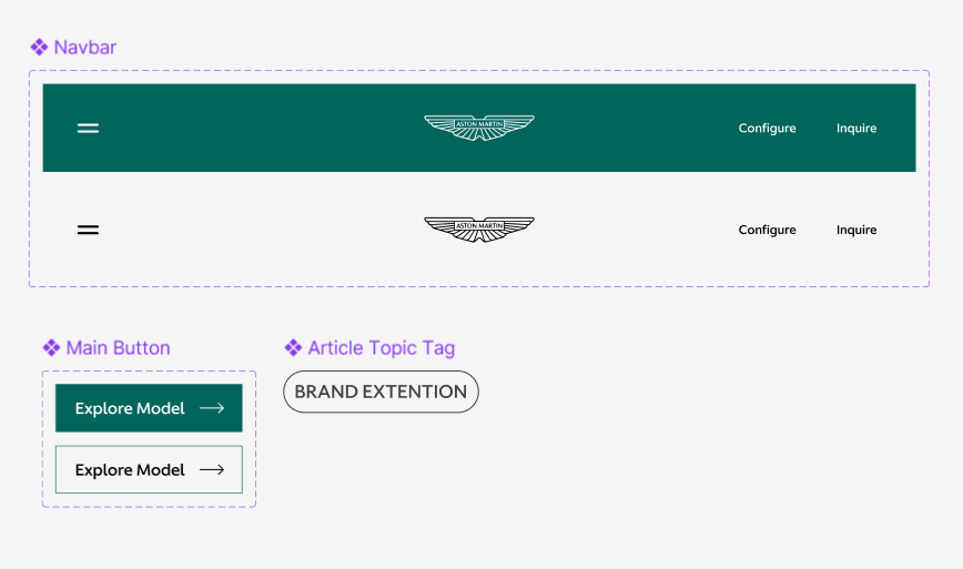
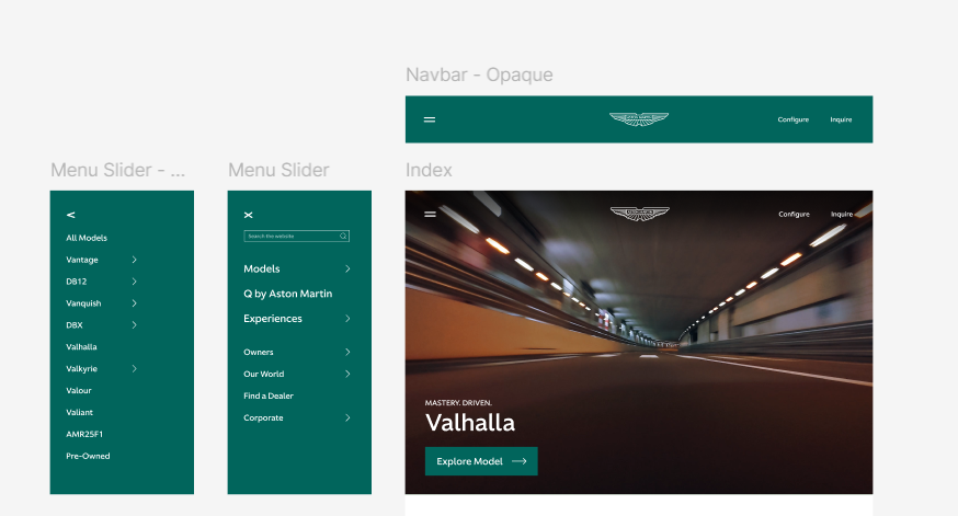
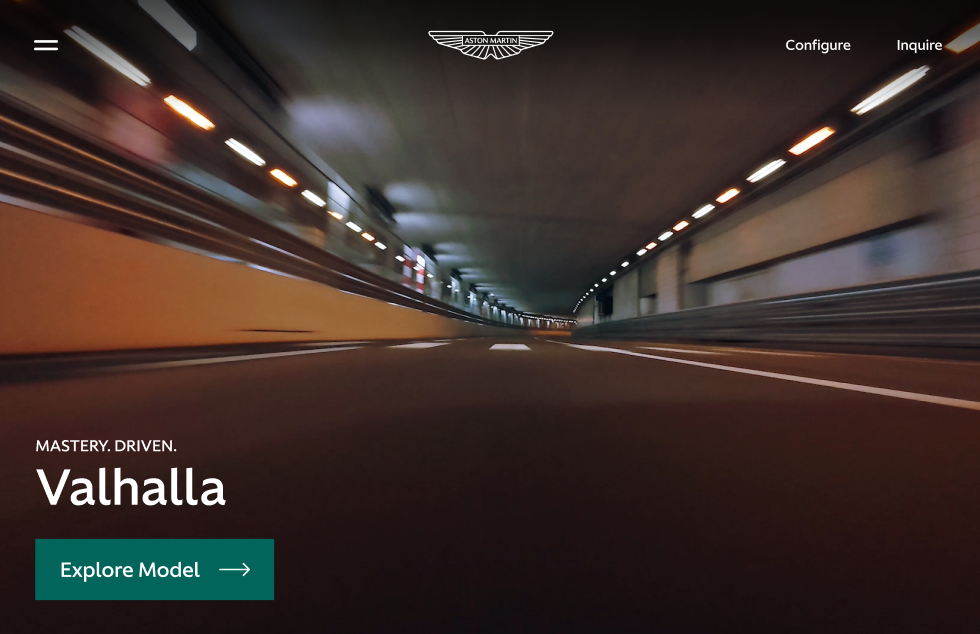
Design Process
Final Product + Takeaways