Case Study — Volvo
Case Study — Volvo
Design Exercise
Duration
Skills Used
Tools
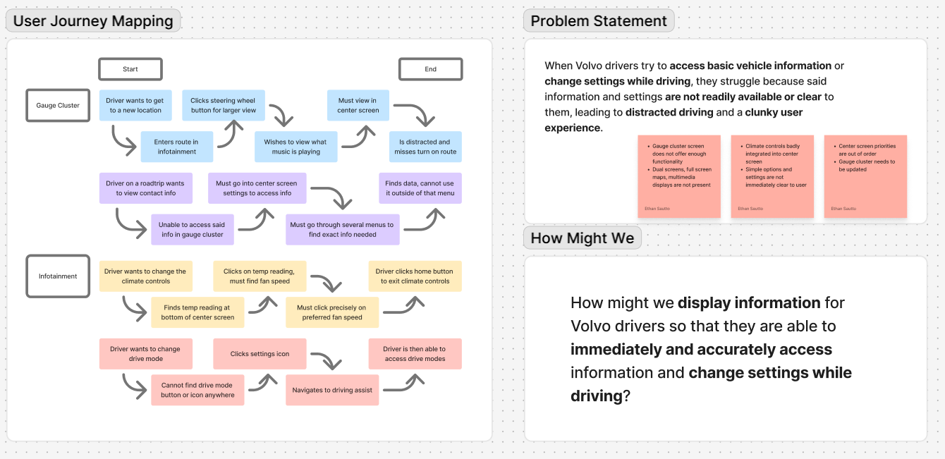
Project Brief
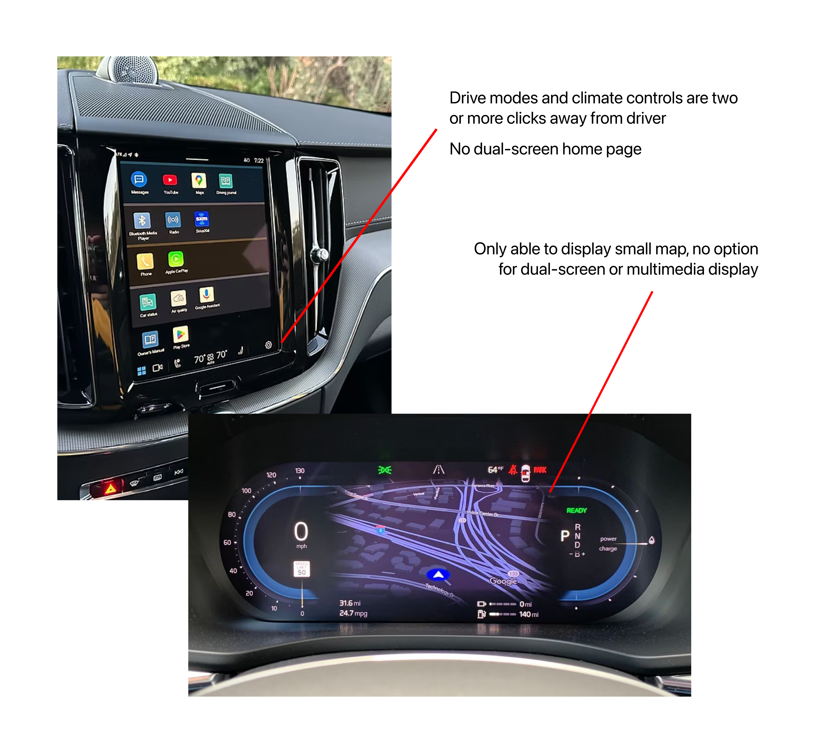
Pain Points
Solution
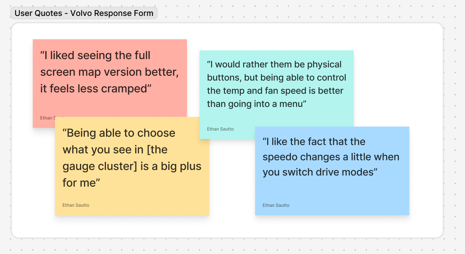
Research
Design Process
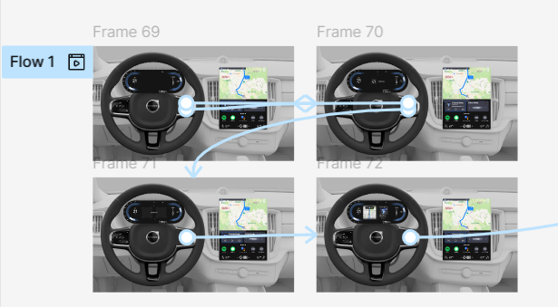
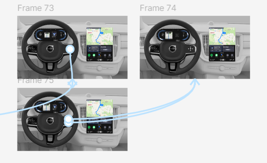
Getting creative with user testing
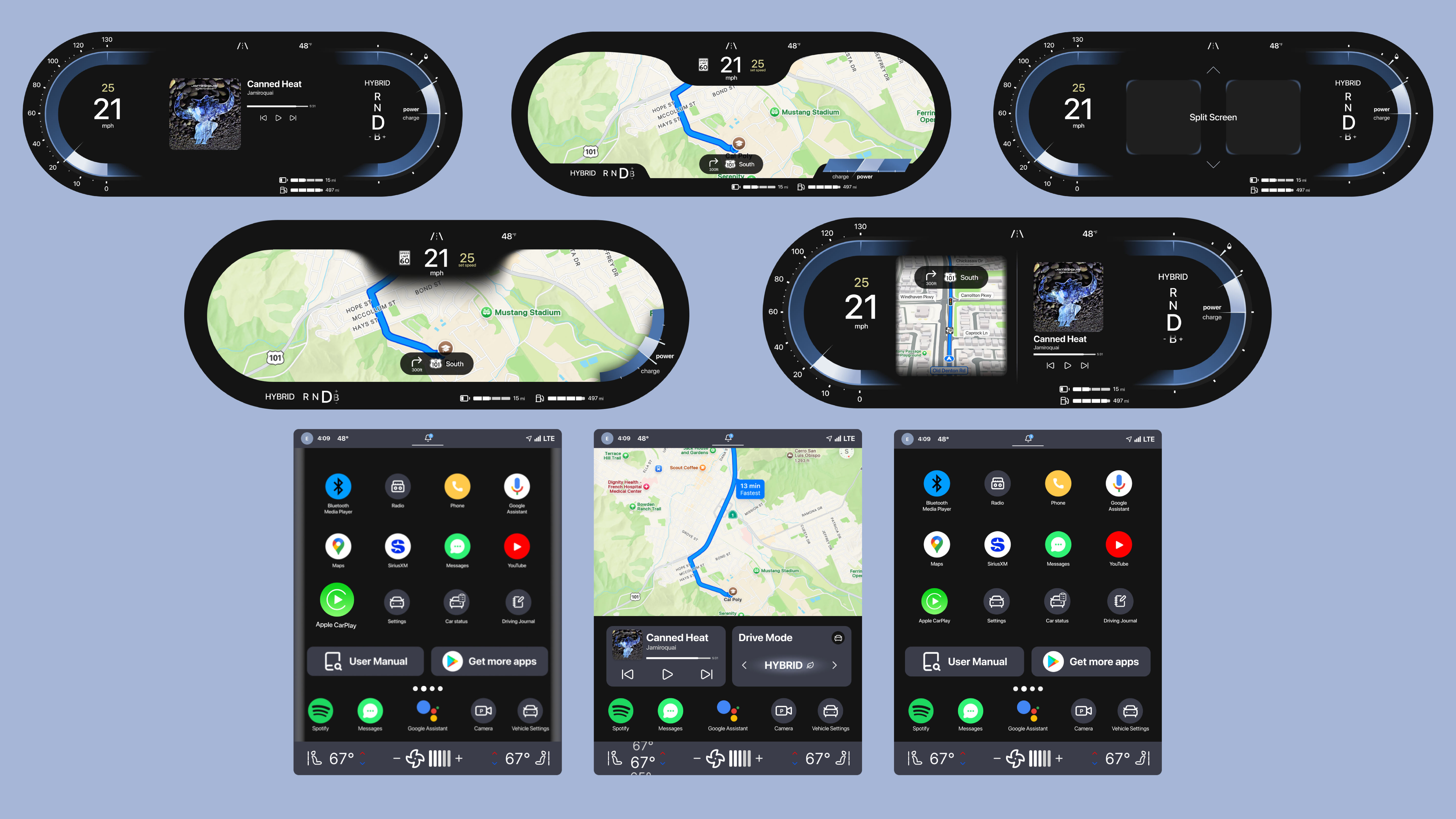
Final Product + Takeaways