The goal here was to observe how small changes to the design system and layout could vastly improve the user experience. While Aston Martin is a strong, innovative brand, their current website suffers from outdated design elements and a layout that gives way to horror vacui.
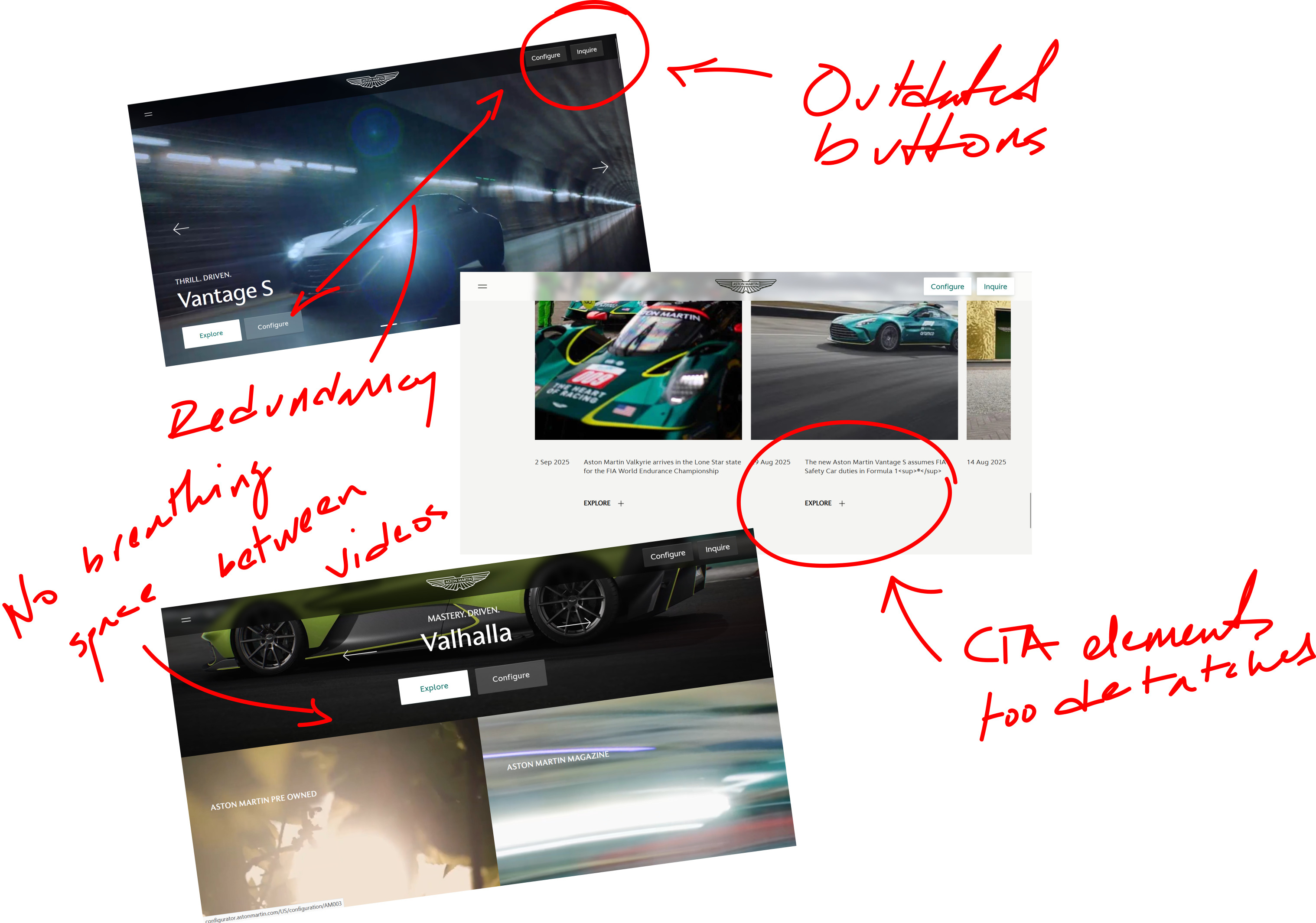
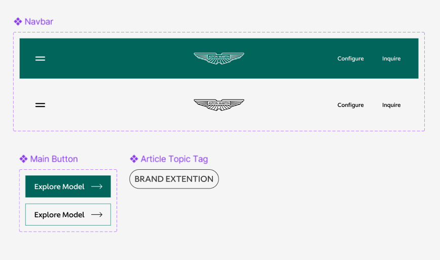
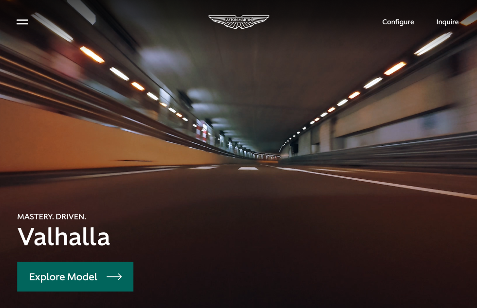
Concerning design elements, the buttons and nav style stuck out to me the most. The dark yet transparent background for the navigation looked out of place. The grey, blocky buttons stuck on top of this background were especially outdated and didn't match the flat Aston Martin logo to their left.
Additionally, the overall layout was very video-heavy and didn't allow for enough breathing space. This made scrolling the website feel claustrophobic.
Overall, the design language of Aston Martin's website felt inconsistent and not representative of their luxury brand.
Since the website is mostly made up of pictures, and since I was on a time limit, I decided to jump right into hi-fi by creating a layout for the index page as well as some basic components that I would use throughout it.
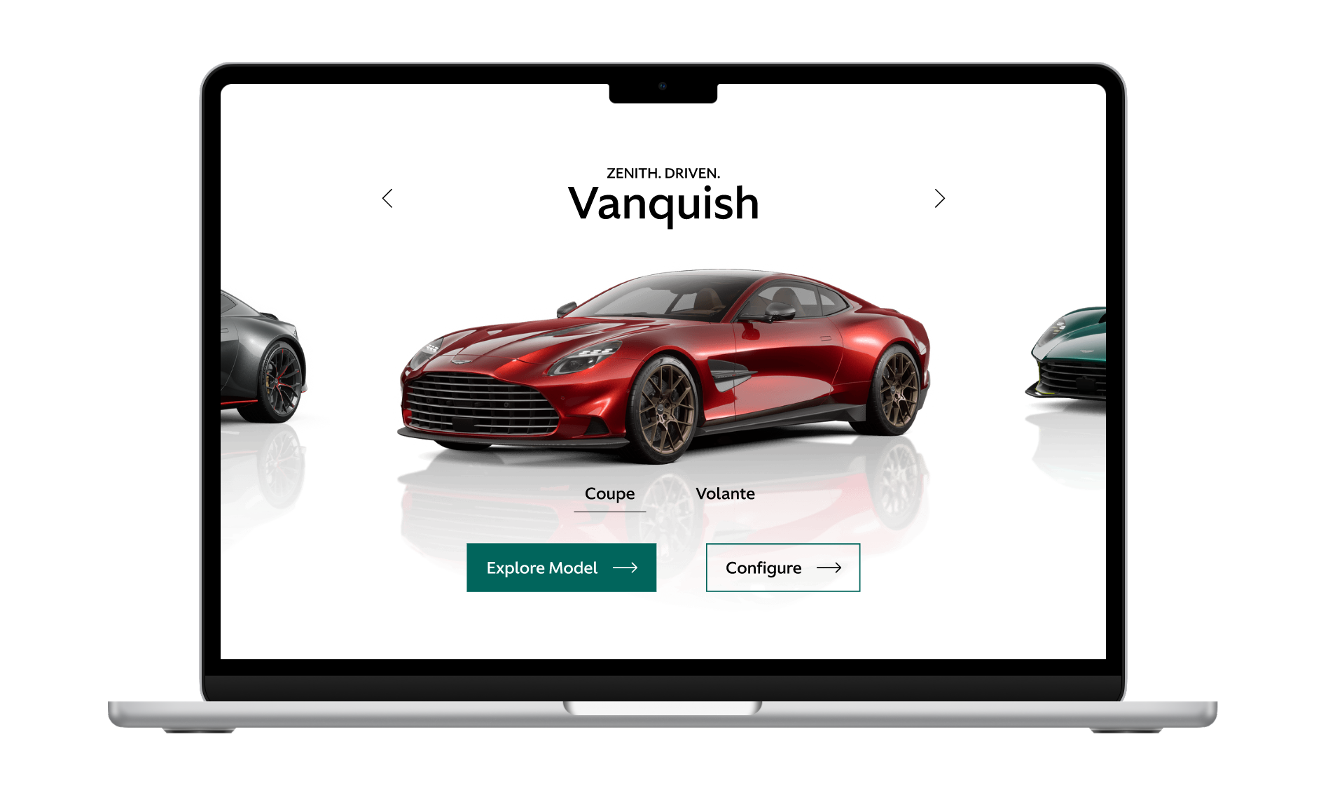
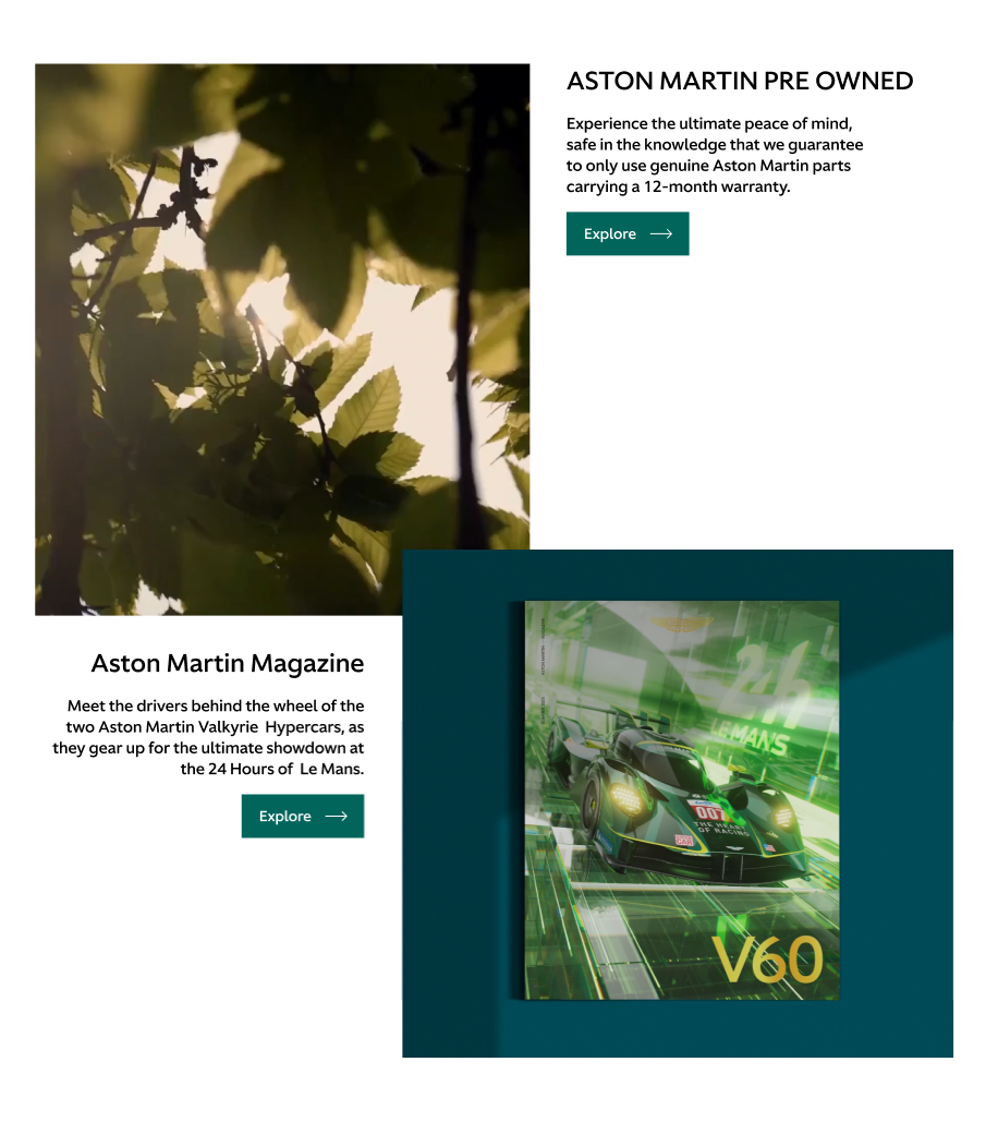
When creating the layout for the index page, my main focus was giving the user more space between large images and videos. In order to achieve this, I both reorganized existing elements as well as redesigned the product lineup preview and the news section.
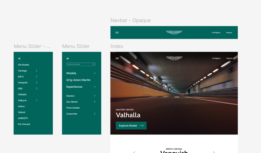
Design elements like the navigation and buttons were updated and standardized, and the overall layout was slightly altered to allow for a more breathable experience.
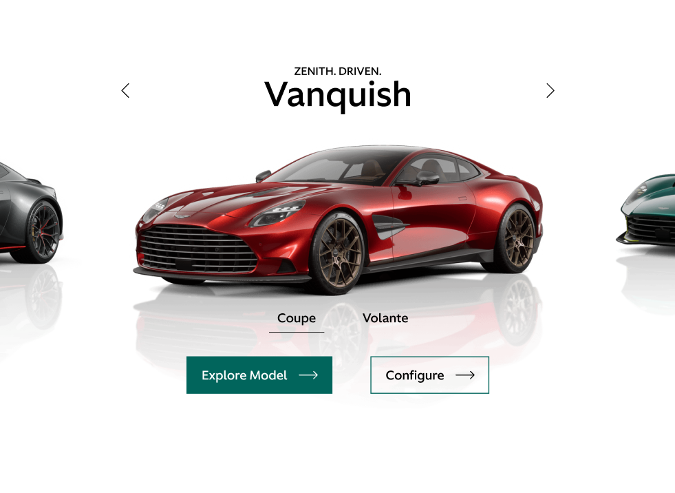
The vehicle lineup previewer was also changed to provide space between videos. It also allows the user to view models as if they were in a showroom, cycling through models and understanding their variants easily.
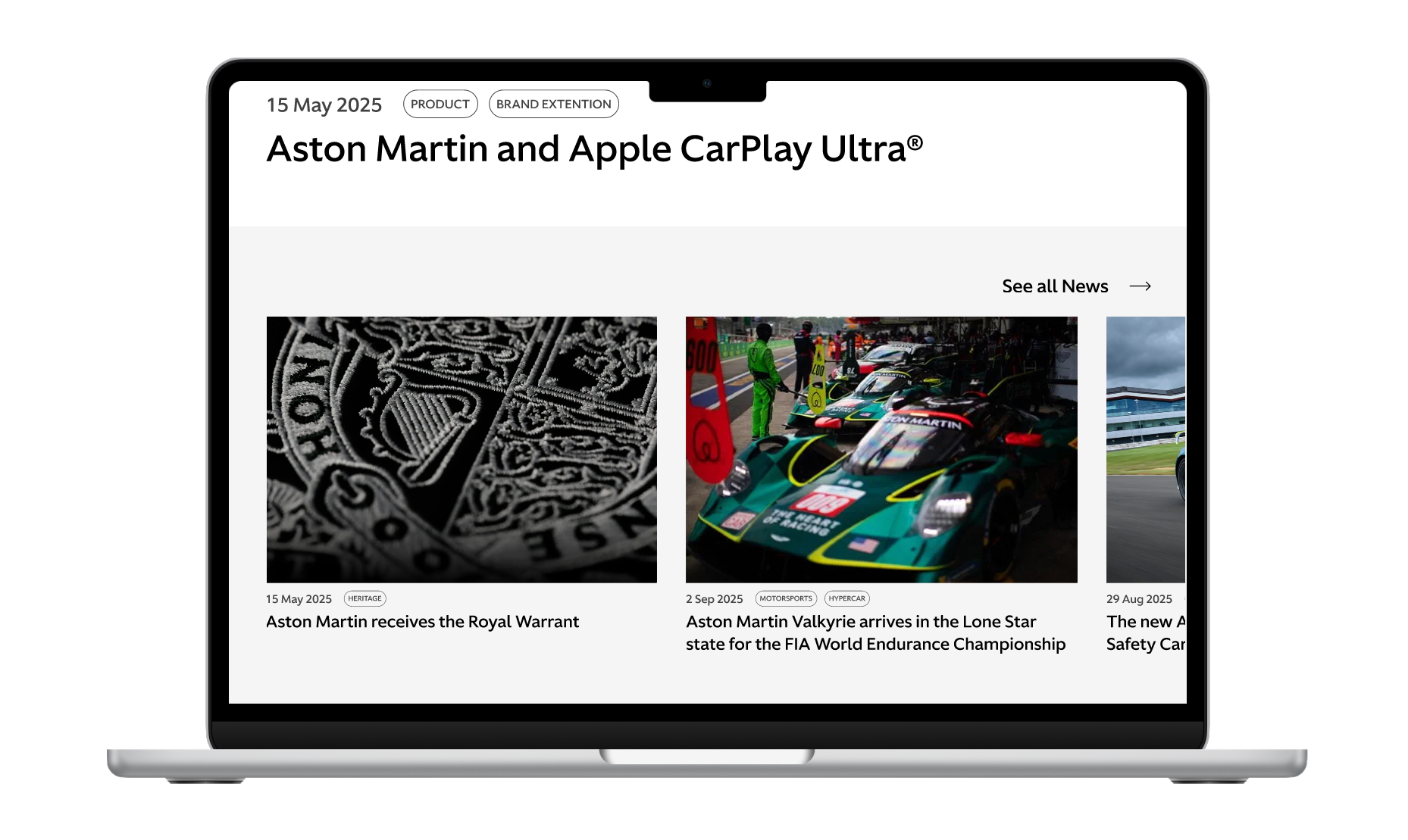
Finally, the "Stories" and "News" sections were combined and redesigned to be less confusing.
This was a quick design exercise that I had a lot of fun with! While this wasn't a full UX study, nor a complete redesign, I found it interesting to see what kind of change could be made by adjusting the right design elements.
Mini-studies like these help me gain a better appreciation for the fundamentals of UI, and how subtle changes can significantly effect a brand image.